The situation
The DfE asked our team to look at their Teacher Professional Development registration system. On paper the brief was about reducing support costs. In reality the system was in a worse state than anyone had admitted.
60% of teachers who started the process never finished it. Those who did spent an average of 45 minutes — and generated 200+ support tickets every week. The department was spending £80k a year just answering questions the interface should have answered itself.
My job was to work out why, and fix it. In 8 weeks.
What I found
The DfE's assumption was that teachers were confused by the requirements — so the proposed fix was more guidance text. I ran 12 interviews before agreeing to anything.
The confusion wasn't the problem. Time was.
73% of teachers were attempting registration during their lunch break — typically 30 minutes, often interrupted. The system had no save state. If you closed the tab, you started over. Most people were getting interrupted, losing their progress, and giving up.
There were two things I hadn't expected going in.
First: 47% of teachers were starting on school computers and finishing on their phones. The system was completely unusable on mobile — form fields overflowed, buttons were unclickable. Nobody at the DfE knew this was happening because the analytics only measured completions, not device switches.
Second: the emotional weight of it. In 8 out of 12 interviews, teachers used words like "stupid" or "idiot" — about themselves. A broken government form was making people feel incompetent.
The bets I made
With 8 weeks and a hard launch date, I couldn't fix everything. I focused on the two things that would most affect whether a teacher on a 30-minute lunch break actually finished: the lack of save state, and the mobile experience.
Bet 1 — Auto-save everything
Every answer saved to a session token every 30 seconds. Teachers could close the tab, switch devices, come back three days later — and pick up exactly where they left off.
The trade-off: it required significant backend work not in the original scope. I had to convince the DfE team to extend the sprint. That conversation wasn't easy — but the data made it hard to argue against.
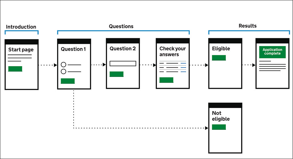
Bet 2 — One question at a time
The original form crammed 8–12 fields onto a single page. I broke it into a step-by-step flow — one question at a time, with a progress bar and a time estimate ("About 12 minutes remaining").
Stakeholders worried it would feel patronising. We tested it on five teachers in a school staff room during lunch. None of them mentioned it. They just completed the form.
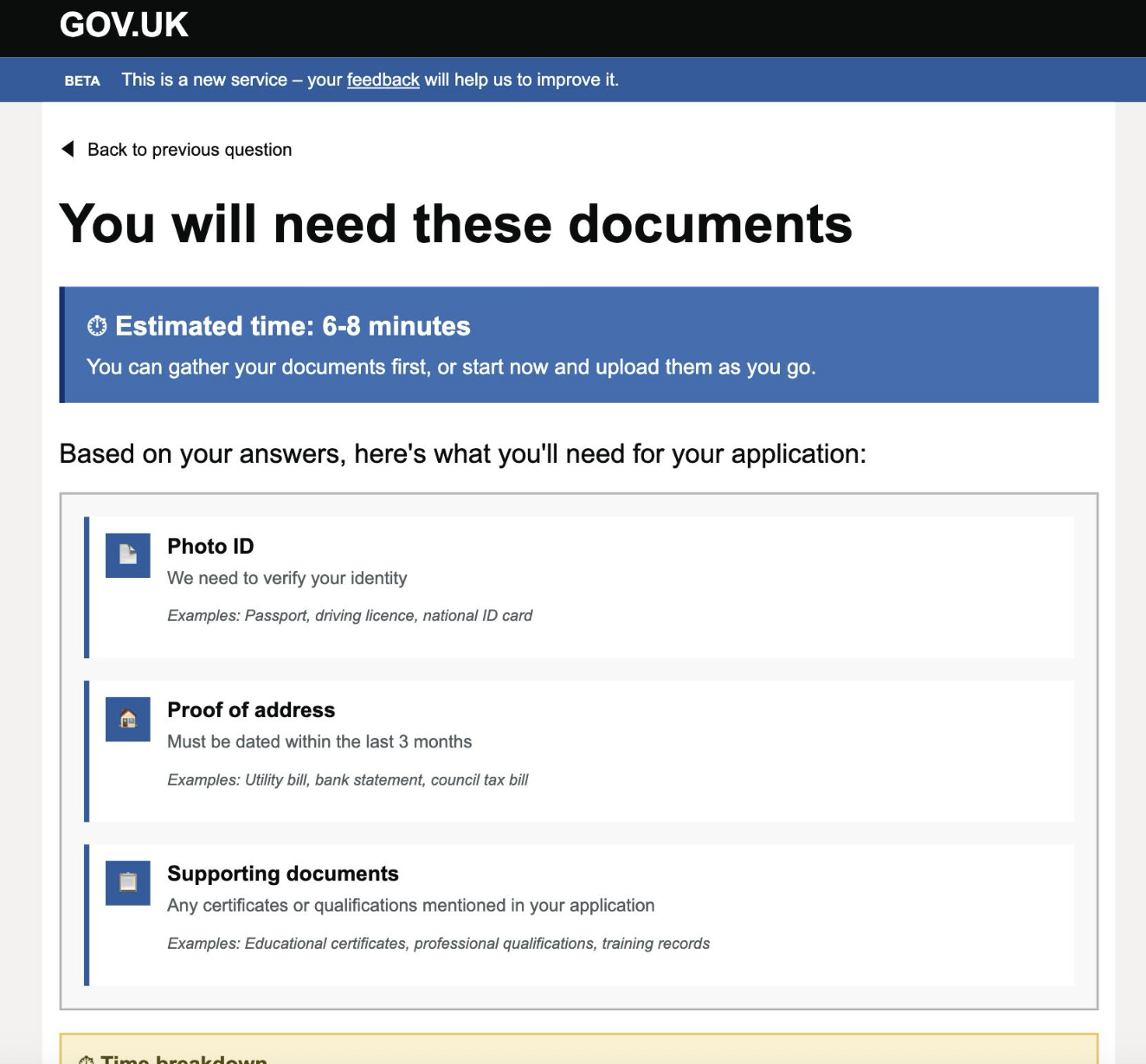
A pre-registration checklist — a one-page summary of exactly what documents you'd need, shown before the form started. If a teacher is going to be interrupted, better they know what they're missing upfront than discover it halfway through.
The curveball
Three weeks before launch, the DfE's security team flagged the session token approach. Storing partial form data across devices introduced a data persistence risk that hadn't been through information governance review. We had 48 hours to find an alternative or drop auto-save entirely.
We ended up with a compromise: a six-character resume code, displayed on screen and emailed to the teacher, that retrieved their session without storing personal data server-side. It was clunkier than I wanted. In testing, about 12% of users didn't notice it and started over anyway.
I pushed for the code to be made more prominent and for an email reminder after 24 hours of inactivity. The email got approved. The prominent placement got cut in a design review I wasn't in the room for. That's the thing I'd undo — not the technical compromise, but missing that meeting.
Outcome
We launched on time. The results came in over the following six weeks.
The patterns — one question per screen, pre-registration checklist, inline time estimates — were adopted across three other DfE registration systems the following year. The mobile completion rate on one of them went from 11% to 58%.
The 12% who missed the resume code and restarted bothers me more than the good numbers please me. It's a solved problem — we just didn't solve it well enough. If I had a second pass, that's where I'd spend the first week.
This case study demonstrates my approach to complex government digital services, inspired by my experience in the education sector. The methodology and problem-solving framework reflect real-world constraints while showcasing user-centered design principles.