The situation
The idea came from a bad night. Six people, one bill, a restaurant in New York City, and twenty minutes of awkward mental arithmetic while the table waited. Every app I tried either required everyone to be registered, forced a tedious manual entry flow, or scanned the receipt and got half of it wrong.
I audited eight competitors properly — not just installed them, but ran them through the same scenarios and logged every failure point. The headline finding: receipt scanning had the highest user satisfaction of any feature (8.4/10) and the lowest technical success rate (66%). Users loved it when it worked. It just didn't work reliably.
That gap — between what users wanted and what the technology could deliver — became the core design problem I spent six months trying to solve.
What the data said
I analysed 10,000 user sessions across competitor apps over six months. The patterns were clearer than I expected.
- 68% of users just want equal splitting. They don't need item-level breakdown, AI scanning, or fairness algorithms. They want to tap once and go home. Building elaborate features for the 32% while making the 68% wade through them is the mistake most apps make.
- Group size is the strongest predictor of splitting complexity. Two-person groups use equal split 89% of the time. Groups of five or more need item-level splitting 48% of the time. The interface should read the room — literally.
- Younger users split by item far more. 18–24 year olds use item-level splitting 45% of the time versus 16% for 35+ users. This isn't a preference quirk — it's a fairness norm difference worth designing for explicitly.
- The friend-addition step kills more sessions than any other. 18% of drop-offs happened here. Most apps treat it as an afterthought. It's the moment you're asking users to context-switch from "splitting a bill" to "managing contacts".
The AI problem nobody was solving
Every competitor treated receipt scanning as binary — it either worked or it didn't. When it failed, users got an error message and were dropped into a blank manual entry form. That's a terrible experience because it wastes the partial work the scan did complete.
The real problem is that AI confidence exists on a spectrum. A receipt scan might get the restaurant name perfectly, misread one item price, and completely miss the tip line. Showing users a result as if it's either fully correct or fully wrong ignores that nuance — and loses their trust.
When the AI is 70% confident about a line item, what should you show the user? A number they might not notice is wrong, an empty field they have to fill in, or something in between that tells them to check this one? I tested all three. The answer surprised me.
The answer was: show them the number, but flag it visually as unverified. Users would quickly scan and correct flagged items far more reliably than they would catch errors in unflagged ones — even when the unflagged data was equally wrong. The visual cue changed their behaviour from passive consumption to active verification.
I built a confidence threshold system: high-confidence results displayed normally, medium-confidence items flagged with a subtle highlight, low-confidence fields left empty with a prompt. The manual correction workflow — swiping to edit, tapping to confirm — was designed to take under three seconds per item.

Decisions I made
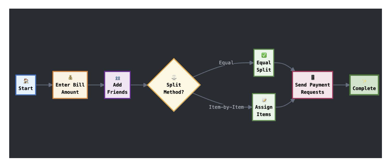
Amount-first vs friends-first flow
I A/B tested two onboarding flows. "Friends first" — add your group before entering the bill — felt logical but had an 82% completion rate. "Amount first" — enter or scan the bill, then add friends — felt backwards to me but hit 89%.
The reason, which I only understood after user interviews: people know the bill amount the moment they get the receipt. They're not always sure who's paying yet. Starting with the certain thing reduced early friction enough to carry users through the rest.
One tap for the majority
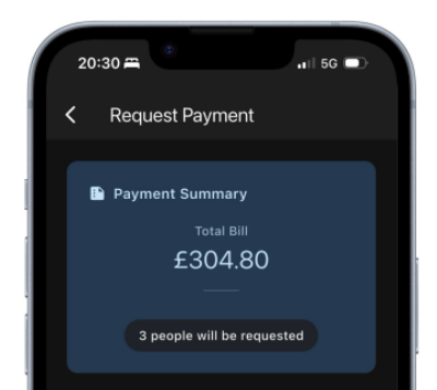
68% of users want equal splitting. I made that the default — no confirmation screen, no "are you sure", just a split and a total. Advanced features (item breakdown, custom percentages, individual exemptions) were one level down, always accessible but never in the way.
This sounds obvious. It wasn't the norm. Every competitor I tested led with their most powerful feature, not their most common use case.
I spent too long on the AI scanning features and not enough on the payment step — the moment after you've split the bill and need to actually send money. That's where real-world attrition happens and where the product has the least to offer. It's also, not coincidentally, the hardest problem to solve as a solo project.
Outcome
Against a competitive baseline of 66–78% completion across different flows, SplitScan hit 89% across all flows — with the amount-first path being the strongest performer.
The AI confidence threshold system is the thing I'm most glad I built — not because it moved a metric, but because it changed how I think about designing for AI features generally. The question isn't "what does the AI show when it works?" It's "what does the UI do with uncertainty?" Most AI product design ignores that second question.
Design for uncertainty, not just success
The AI confidence threshold approach — flag unverified items rather than hiding or ignoring doubt — improved scan accuracy perception more than any improvement to the model itself.
Default to the majority use case
68% of users want to split equally and leave. Every interaction that slows that down costs you. Advanced features should be one tap away, never in the default path.
Start with what users know
Amount-first beat friends-first not because it was more logical, but because the bill amount is certain and the group composition isn't. Anchoring on certainty reduces early friction.
Satisfaction ≠ success rate
Receipt scanning was the most loved and least reliable feature. High satisfaction with low reliability creates more frustration than a feature nobody cared about failing. Love creates expectation.