
The situation
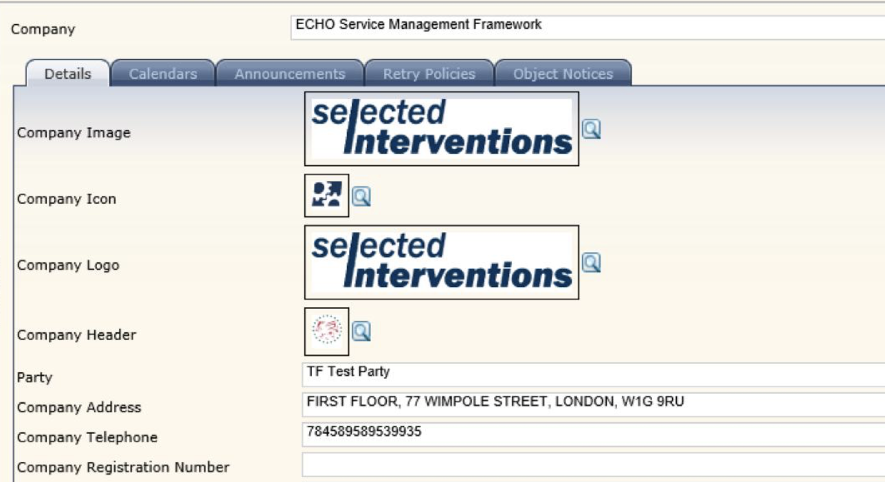
ECHO had scaled fast. The platform — used by dispatchers managing waste collection fleets and by field workers on mobile — had grown through feature additions rather than design decisions. Nobody had ever stopped to ask whether any of it fit together.
By the time I joined, the codebase had seven variations of the primary button. The data tables looked different on every page. The mobile experience for field workers — people using the app in the rain, in a cab, with gloves on — was an afterthought built on top of a desktop layout.
The brief was to modernise the platform. The real job was to give engineering a system they'd actually want to build with.
The audit
Before designing anything I spent two weeks cataloguing what existed. I screenshotted every component state across every page and laid them out in a Figma file. It was ugly. That was the point — it needed to be ugly enough to show stakeholders why this mattered.
The audit surfaced three things that shaped everything after:
- No accessibility baseline. Contrast ratios across the product were failing WCAG AA at dozens of touchpoints. This wasn't a polish problem — it was a legal exposure.
- Mobile was an afterthought. Field workers — a significant portion of actual daily users — were using a desktop layout squeezed onto a phone. Core workflows like marking a collection complete were nearly impossible with one hand.
- Cognitive load was the root cause of support tickets. Most UI-related tickets weren't bugs. They were users asking where things had moved, or why the same action worked differently on different pages.
What I built
I built from tokens up — colour, typography, and spacing as the foundation, components on top, patterns last. The reasoning: if the tokens aren't right, nothing built on them will be either. And tokens are the easiest thing to change later.
For dispatchers (desktop)
Rebuilt data tables with fixed headers, sortable columns, and bulk-action patterns. Introduced progressive disclosure across dashboards — high-level status first, detail on demand. Standardised the hierarchy so the most important action was always the most visually prominent.
For field workers (mobile)
Redesigned core mobile workflows from scratch around one-handed use. Thumb-zone targets, swipe actions for common tasks, and offline-first patterns for areas with patchy signal. This is where the biggest UX gains came from — it had simply never been designed for the people using it.
Whether to rebuild components incrementally alongside the existing UI, or to draw a hard line and replace everything at once. I pushed for the clean break. It caused short-term pain during migration but meant we weren't maintaining two systems. In hindsight it was the right call — the incremental approach at another project I'd seen dragged on for two years and the legacy components never fully died.
Getting adoption
94% component adoption doesn't happen because you designed good components. It happens because you made it easier to use the system than to work around it.
The first version of the Figma library sat unused for three weeks. Engineers kept building their own versions. When I asked why, the answer was honest: the documentation was written for designers, not developers. It showed what things looked like. It didn't say when to use them, what the DOM structure should be, or what the acceptable variants were.
I spent a week rewriting every component's documentation from a developer's perspective. Usage guidelines, anti-patterns, code snippets, the rationale behind decisions. Then I ran two working sessions with the front-end team where we built a new feature page together using the library. After that, adoption jumped from around 40% to over 90% within a month.
The second thing that helped: I sat in on engineering sprint planning for two months. Not to design in the room — just to hear which components were causing friction and fix them before they became workarounds.

Outcome
The numbers were strong. But the one I'm most proud of isn't on this list — it's that when I left, the design system was being actively maintained by the engineering team without me. That's the real measure of whether a design system worked.
Audit before you design
Showing stakeholders a wall of inconsistent components in one Figma file did more to secure buy-in than any business case I could have written.
Document for developers, not designers
A component library nobody uses isn't a design system — it's a Figma file. The documentation gap was the real adoption problem.
Accessibility can't be retrofitted
Fixing contrast ratios after the fact is harder and slower than building to standard from day one. The audit made this impossible to ignore.
Sit in engineering sprint planning
I learned more about where the system was breaking down from two months of sprint planning than I would have from a month of usability testing.